Are you planning to open a retail store? If so, one of the most important decisions you’ll need to make is the layout of your store. A well-designed layout can help boost sales and create a more positive experience for customers.
In this guide, we’ll walk you through some of the most important factors to consider when designing your retail store layout. We’ll also share some examples of successful layouts from real-world businesses. Let’s get started!
What is customer flow and why is it important in-store layout and design?
Customer flow is the movement of customers through a store. Good customer flow is important in-store layout and design because it can help improve sales.
There are a few things to consider when designing a store with good customer flow in mind. First, you need to think about the path customers will take through the store.
You want to make sure there are no dead ends and that the path is easy to follow. You should also consider the placement of merchandise. You want to make sure that customers can easily see and reach the merchandise they are interested in.
You may also want to think about creating different areas in your store. This can help create a sense of urgency for customers and encourage them to buy more items.
Finally, you need to make sure that the checkout area is easy to get to and that there are enough cash registers open at all times.
Good customer flow is important for stores because it can help improve sales. By considering the factors mentioned above, you can create a store layout that encourages customers to move through the space and buy more items.
What are the different types of store layouts and designs?
When it comes to retail, store layout and design is key. Your average customer will enter your store, take a quick look around, and then leave if they don’t find what they’re looking for. With that in mind, it’s important to have a well-organized and thought-out store layout that will make it easy for customers to find what they need.
There are a few different types of store layouts that you can use in your retail business. The most common are the grid layout, the circular layout, and the freeform layout. Let’s take a closer look at each one.
Grid Layout:
The grid layout is probably the most common type of layout used in retail stores. It’s simple and efficient, with each aisle running perpendicular to the next. This layout is perfect for smaller stores that want to maximize their space.
Circular Layout:
The circular layout is perfect for large stores with a lot of inventory. Customers can easily walk around the store and find what they’re looking for. However, this type of layout can be confusing for customers who are new to the store.
Freeform Layout:
The freeform layout is perfect for stores that want to create a unique shopping experience. This type of layout allows you to move merchandise around and create different areas within the store. However, it can be difficult to track inventory with this type of layout.
5 real-life examples of good store design
Apple Store
When it comes to storing design, Apple is a pioneer. Its sleek, minimalist stores have become an iconic part of our landscape. From the moment you walk in, you feel like you’re in a special place.
Everything has been thought through, from the layout to the use of natural light. There’s no clutter, and the focus is on the products.
Trader Joe’s
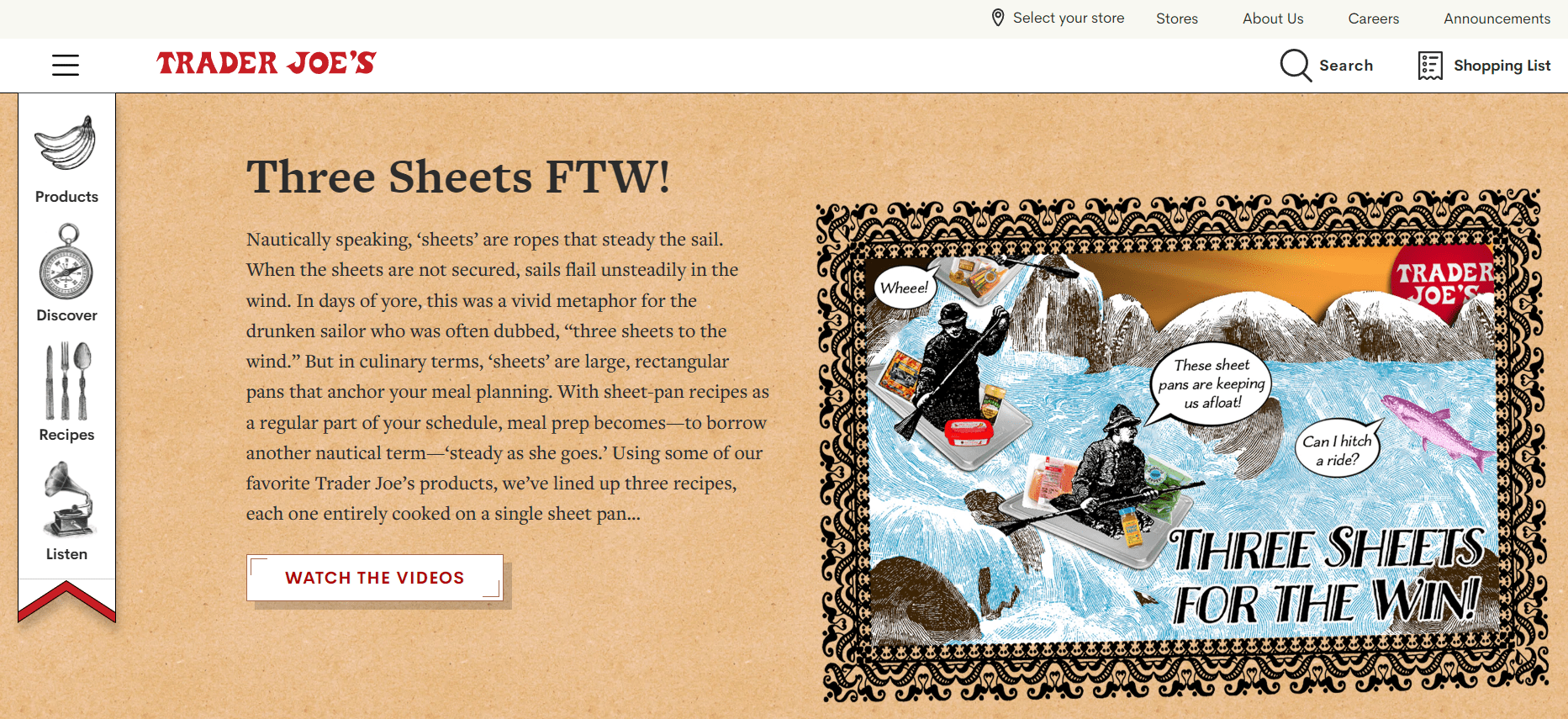
Trader Joe’s is another store that takes great care with its design. It has a funky, eclectic vibe that sets it apart from other grocery stores. The shelves are packed with unique products, and there’s always something new to discover. The store is brightly colored and filled with surprises, making it a fun place to shop.
Anthropologie
Anthropologie is a favorite among fashion-conscious women thanks to its stylish clothes and home decor. But the store’s design is just as important as the merchandise. It’s airy and bright, with an eclectic mix of furniture and accessories. There’s something for everyone, whether you’re looking for a new piece of jewelry or a sofa for your living room.
Barnes & Noble
Barnes & Noble is another retailer that takes store design seriously. Its stores are large and airy, with plenty of space for shoppers to wander around.
There are comfortable chairs where customers can relax and read books, and the shelves are well-organized so it’s easy to find what you’re looking for. The stores are also brightly lit, making them feel cheerful and inviting.
Ikea
Ikea is known for its affordable furniture, but the company also takes great care with its store design. Each Ikea store is huge, with aisles upon aisles of furniture and accessories.
The layout is simple but effective, making it easy for shoppers to find what they need. And unlike some other furniture stores, Ikea doesn’t overwhelm shoppers with choices; instead, it focuses on providing well-made furniture at an affordable price point.
Quick Links
- Amazon Storefront Link – Everything You Need To Know
- Amazon FBA Vs Dropshipping Launch Your Own E-commerce Store
- What Does Amazon Renewed Mean? Guide For Beginners
Conclusion- The Ultimate Guide to Retail Store Layouts: Must Read 2026
After reading this blog post, you should have a much better understanding of how store layouts can impact customer behavior. By utilizing some of the techniques we’ve discussed, you can encourage customers to spend more time in your store and make impulse purchases.
Remember, the key is to create a layout that is both efficient and appealing to customers. With a little bit of planning, you can easily improve your retail store layout and increase sales.


